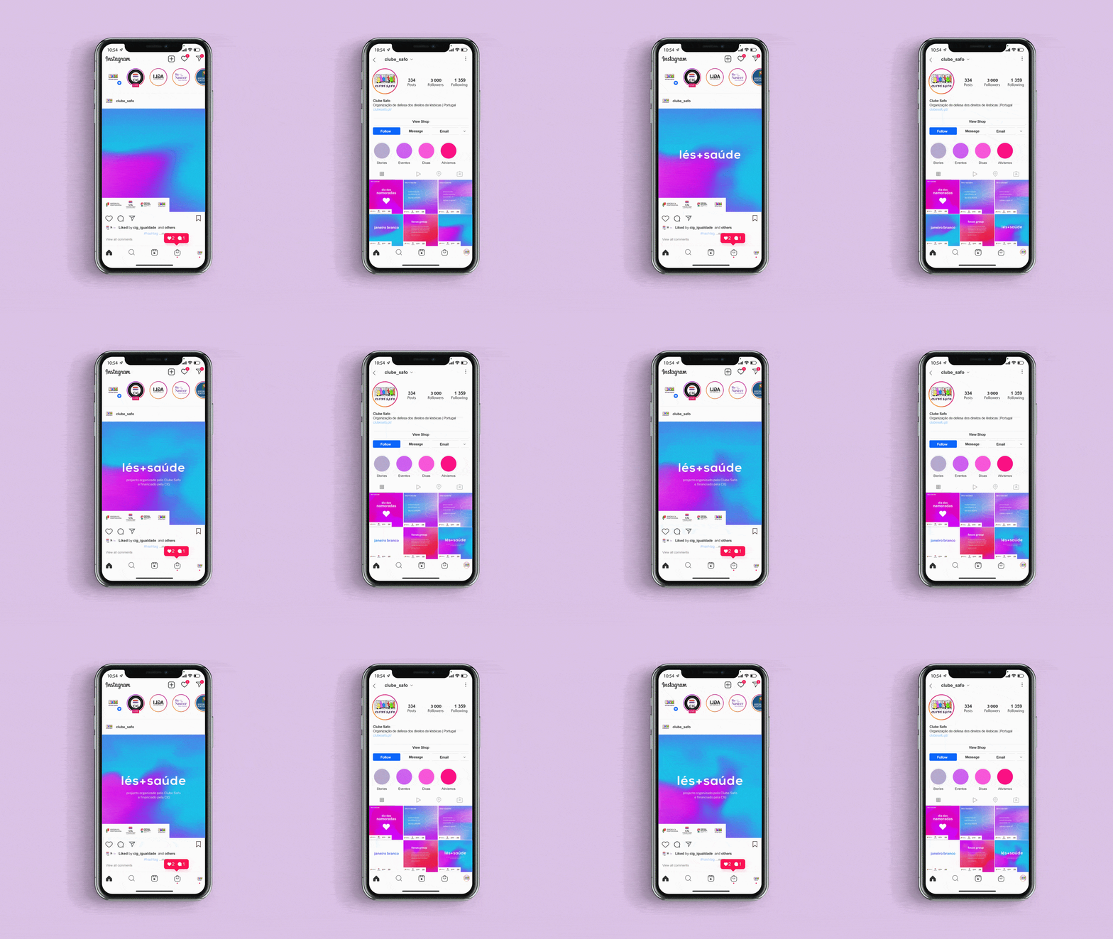
This project results from the desire of the Clube Safo association for the defense of lesbian rights in Portugal. Focusing on the health of women who have relationships with women, motherhood, sexual health, and access to health. This project is funded by CIG.
This project mainly seeks to give people a voice. With this challenge, I searched for the voice through feelings like empathy, trust and open-mindedness - that characterizes it.
In order for there to be an openness of us being our true version and for there to be an open and empathetic discussion about lesbian health.
Branding/ 2022
In order for there to be an openness of us being our true version and for there to be an open and empathetic discussion about lesbian health.
Branding/ 2022

PROCESS
This project mainly seeks to give people a voice. With this challenge, I searched for the voice through feelings like empathy, trust and open-mindedness - that characterizes it.
In order for there to be an openness of us being our true version and for there to be an open and empathetic discussion about lesbian health.

For the logo, I looked for a simple and clear communication. It's a flexible and accessible logo, and it gains power with the graphic identity.

This project's main colors are purple, red, and blue.The red is associated with health, the purple with the LGBT+ community, and the blue symbolizes empathy. Black and white are secondary colors that complement the graphic identity.


Gradients are graphic elements that will bring dynamism to the project. Joining the colors of the graphic identity, red, purple, and blue, forms a dynamic element.

These graphic elements will bring a representation of what the project will address. These elements are represented by circles conveying a feeling of union. Sexual health is represented t.hrough the connection of two circles, thus symbolizing the sexual connection between LGBTQ+ partners. Motherhood is symbolized by three overlapping circles, as in layers. Access to health is graphically represented as circles pointing in a direction.


I was responsible for Lés+Saúde's social media. The goal was to communicate information and to open a discussion about this topic.
